Start from color matching to improve housing style
Start from the color matching to improve housing style
In some Europe and America countries,a perfect design team have their own professional color designer,who is in charge of completing the determination of the overall design style of the house. But if we want to decorate our own house and are not as professional as color designers, what is the best way to do it?
Here are a few color schemes for your reference, perhaps it will make your house design more deluxe and textured.
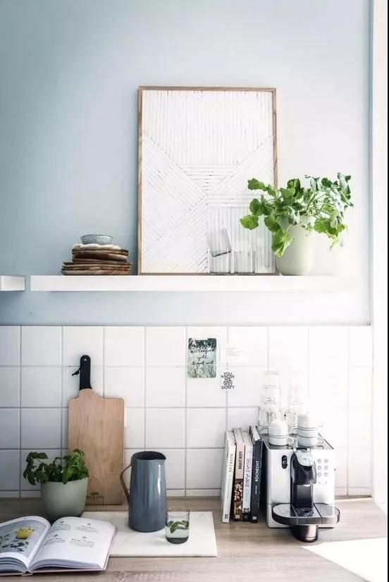
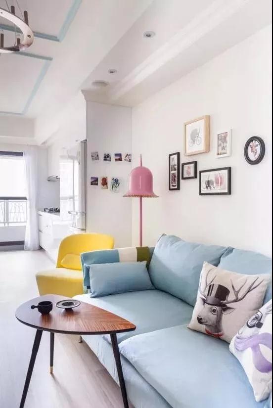
NO.1 Blue: That deep elegant amorous feelings
Quiet, noble, deep, romantic. Blue brings people a lot of beautiful enjoyment. When the blue purity in the living room stunning appearance, you may feel not only the oncoming elegance, more is a kind of incomparably calm living atmosphere, it makes the impetuous heart more free release space.
●Baby blue background with rice family home, light and steady sense of organic combination, bring natural grandeur. The appropriate match also shows the comfortable atmosphere of living at home.
●The ocean style space is suitable for putting more light blue furniture, the romantic soft tone softens the overall color visual feeling, is rendering the romantic atmosphere.
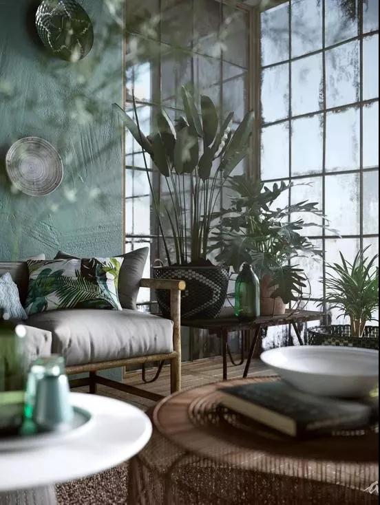
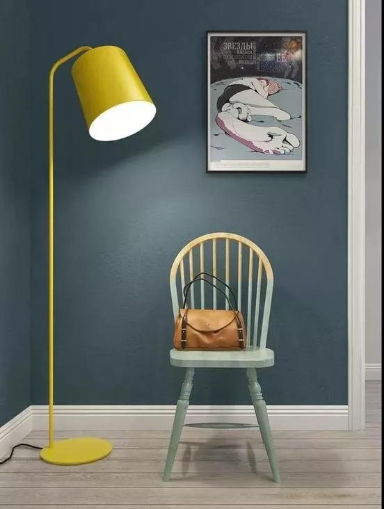
NO.2 Green:Popular from fashion to furniture
Color psychologists have pointed out long ago that people feel calm in short-wavelength colors (such as green), while those with longer wavelengths (such as red and yellow) are more likely to be excited. So there is green in house, like owning sense of security.
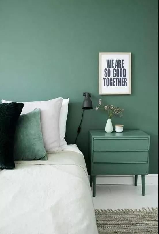
●Grey green brightness and purity are relatively low, which will not make our eyes feel glaring, also can bring low-key, peaceful atmosphere to the space. Grey Green is more suitable for a large area of wall color.
●Dark green as the keynote of the wall, white sheets pure and safe, with the dark green of the match will not seize the initiative of space, but also make the space more elegant and natural
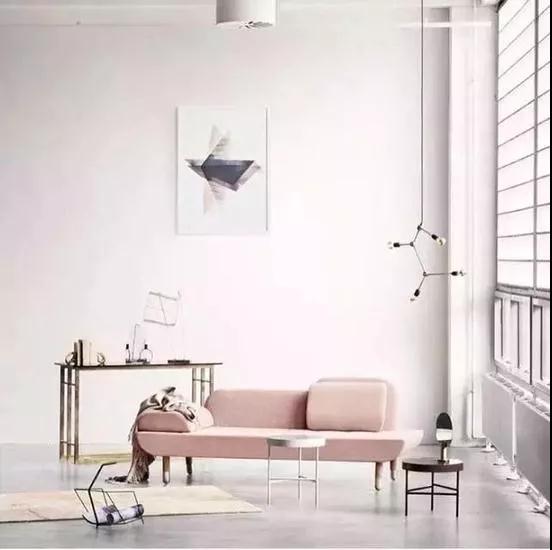
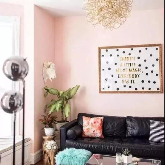
NO.3 Pink:High class Nordic color matching rule
High-grade pink was no doubt the most attractive color in 2018, whether clothing and housing, which attracted a lot of people who have a teenager girl heart.
●Grey, as the king of the easygoing with other colors, collides with pink (light pink, lotus root pink) can show a modern sense.
●Black leather dated sofa with pink environment,fresh off the Nordic style, it can't help but make a friend think: you're such a special person.
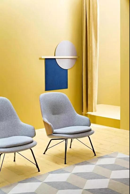
NO.4 Saffron:Restore the sense of glamour that life should have had
Saffron has a color close to the sun, used in the home can bring us comfortable and beautiful as sunshine, for the restless heart to bring stability and dependence.
●A good design should not only show extraordinary charm, but also closely linked with life. Like this set of colors, the white background is dotted with ginger yellow sofas, showing light extravagance as well as sunshine feeling.
●Heavier colors are generally used in the lower part, lighter colors in the upper part, the feeling of being heavy on top and light on the bottom can not be good.
Flexible use of color collocation, through the visual perception of color, and then use it to create. Not limited to any color collocation, not afraid to challenge the bold impact of color, to create their own unique color world!

TAG: color matching housing housing design interior design furniture
